You know the drill. You’re crafting an amazing AI image, you add a simple phrase like “Hello World,” and suddenly your cutting-edge AI transforms it into “Hlleo Wolrd” or some alien script. It’s frustrating, right? We’ve all been there, staring at perfectly rendered visuals ruined by a garbled mess of text.
Key Takeaways
- Best for Quality & Accuracy: Ideogram (by a mile!)
- Best for Overall Image/Composition (without text): DALL-E 3
- My Key Tip: If your image needs legible text, use Ideogram. Seriously, don’t even try DALL-E 3 for complex text.
The Core Problem: Why AI Image Generators Struggle with Text (and Why it Matters)
Generative AI is brilliant at understanding abstract concepts, lighting, composition, and even complex art styles. But ask it to spell “pizza” on a sign, and it often falters. Why? Because these models are primarily trained on visual patterns, not linguistic ones in the same way. They see text as another visual element, a “texture,” rather than a string of characters with specific meaning.
It’s More Than Just Spelling: Readability, Placement, and Style.
The challenge isn’t just about getting the letters right. It’s about ensuring the text is readable, placed logically within the scene, and matches the intended style (think neon, vintage, handwritten). Most AI struggles with all of these, making your beautiful AI art unusable for anything practical like a marketing graphic or a logo.
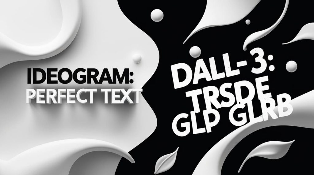
My Personal Frustration: When “Hello World” Becomes “Hlleo Wolrd.”
I’ve spent hours trying to coax legible text out of various AI image generators, and DALL-E 3 has, unfortunately, been a consistent offender. My biggest challenge was trying to create a simple graphic with “Hello World” on it. Here’s what DALL-E 3 gave me:

As you can see, it’s not even close. This is the kind of output that makes you want to throw your keyboard across the room.
My Head-to-Head Methodology: How I Tested Ideogram vs. DALL-E 3
To settle this once and for all, I decided to run a controlled experiment. I took the exact same text prompts and ran them through both Ideogram AI (which I use frequently) and DALL-E 3 (accessed via my ChatGPT Plus subscription). My goal was to see which tool truly understood the nuance of text generation.
The Arena: Ideogram AI and DALL-E 3 (via ChatGPT Plus).
- Ideogram AI: Known for its text capabilities, often cited as a leader in this area.
- DALL-E 3: Praised for its incredible image quality and prompt understanding, but its text game is often debated.
The Prompts: Simple, Complex, and Contextual Text Challenges.
I crafted a series of prompts designed to test different aspects of text integration, from basic spelling to complex styling and placement. I generated multiple variations for each prompt in both tools to ensure a fair comparison.
- Example 1: Single word on a clean background.
- Example 2: A short phrase on an object.
- Example 3: A longer sentence in a specific style.
- Example 4: Text incorporated into a logo design.
Ideogram’s Text Superpower: My Experience with Uncanny Accuracy
After running my tests, the results were clear: Ideogram consistently produced accurate, legible, and well-integrated text. It felt like magic after years of AI text fails.
Simple Text: “Hello” Done Right.
My first test was straightforward: “A minimalist image with the text ‘Hello World’ in a clear, sans-serif font.”

Boom. Perfect. Every time. No weird characters, no misspellings. Just what I asked for.
Contextual Text: Making “Open Me” Actually Mean Something.
Next, I pushed it a bit: “A whimsical vintage-style box with the words ‘Open Me’ printed clearly on the lid.”
Again, Ideogram delivered. The text was part of the design, not just slapped on. It even matched the vintage aesthetic.
Styled Text: Neon Dreams and More.
What about specific styling? I tried: “A futuristic cityscape at night with a neon sign that reads ‘Welcome to the Future’.”
I was seriously impressed. The neon effect was spot on, and the words glowed exactly as I imagined.
Logo Designs: Where Ideogram Truly Shines.
For me, this is where Ideogram became indispensable. I tried: “A modern tech logo with a gear icon and the brand name ‘Creative Hub’ with a tagline ‘Innovate. Design. Inspire.’.”
This is a game-changer for anyone needing quick logo concepts or marketing materials. The text is consistently accurate, making these outputs actually usable.
My Secret Sauce: Prompting Tips for Ideogram Text Success.
I’ve learned a few tricks that make Ideogram’s text generation even better:
- Always put your desired text in quotes “” and often specify text: in the prompt. This tells Ideogram, “Hey, this is actual text, not just a visual descriptor.”
- Example: A vintage poster with text: “Coffee Break” and an illustration of a steaming mug.
- Specify font styles if you can. Words like “bold sans-serif,” “elegant script,” “distressed,” “handwritten,” or “futuristic” can guide the AI effectively.
- Keep the text concise for best results. While Ideogram handles longer phrases well, shorter, punchier text often integrates more seamlessly into complex scenes.
- Experiment with aspect ratios. If you need a banner with text, a wider aspect ratio (e.g., 16:9) often provides more room for the text to breathe and be placed legibly.

DALL-E 3’s Text Troubles: My Honest Assessment
Now, let’s talk about DALL-E 3. While I absolutely love DALL-E 3 for its incredible image quality and ability to interpret complex prompts for visuals, it’s a completely different story when text is involved.
The “Garbled Mess” Phenomenon.
When I ran the same “Hello World” prompt through DALL-E 3, here’s what I got:
Yep, more of the same. The text is consistently mangled, misspelled, or just plain illegible. It’s the ultimate “AI generated” tell.
When Context Goes Wrong: Text on Objects.
My “Open Me” box prompt didn’t fare much better with DALL-E 3:
The box itself might look great, but the text is a jumbled mess, completely undermining the prompt’s intent.
Styling is a Struggle: A Lack of Control.
Asking DALL-E 3 for “Welcome to the Future” in a neon sign? It struggles to interpret the text accurately, let alone apply a specific style consistently.
The visual idea of a neon sign might be there, but the text itself is rarely correct or well-styled.
Logo Nightmares: Unusable Results.
Trying to get a usable logo with text out of DALL-E 3 for “Creative Hub”? Prepare for disappointment.
I found that DALL-E 3 often generates something that looks like text, but it’s rarely what you asked for. This means any logo attempts are pretty much unusable without heavy post-editing.
DALL-E 3’s Strengths (When Not Asking for Text).
Don’t get me wrong, DALL-E 3 is a fantastic tool! When you remove the text requirement, it truly shines. Its ability to create stunning, photorealistic, and artistically coherent images is top-tier.

For pure image generation, it’s hard to beat. But add text, and it’s a different beast.
Are there any DALL-E 3 text workarounds? (My findings).
Through my extensive testing, I found that:
- “Put text in quotes” helps minimally. DALL-E 3 might acknowledge the text is important, but it still often takes liberties with spelling and placement.
- Keeping it extremely short (1-2 very simple words) sometimes works, but it’s inconsistent. You might get “YES” right on the 5th try, but “No Problem” is a gamble.
- You often have to regenerate many times to get something even remotely passable, and even then, it’s usually not perfect. It’s a waste of credits and time, IMO.
The Bottom Line: When to Use Which Tool for Text
After putting both tools through their paces, my recommendation is crystal clear.
Choose Ideogram When…
You absolutely, positively need accurate, legible text in your images.
- Logos and Branding: Creating mockups, initial concepts, or simple logos with your brand name.
- Social Media Graphics: Banners, posts, or stories that require specific text overlays.
- Posters and Advertisements: Any visual content where text conveys the core message.
- T-shirt designs, memes, or product labels.
Ideogram is built differently, with an architecture that prioritizes text fidelity. It’s the tool I reach for every single time I need words in my AI art.
Stick with DALL-E 3 When…
Overall image quality, composition, photorealism, or complex artistic concepts are your top priorities, and text is either not needed or you plan to add it manually in an external editor like Photoshop or Canva.
- Stunning conceptual art.
- Highly detailed scene generation.
- Exploring abstract visual ideas.
- Generating variations of existing images without text elements.
DALL-E 3 is truly exceptional at creating breathtaking visuals, but it’s like asking a brilliant chef to also be a master calligrapher – it’s just not its specialty.
My Final Verdict
So, what’s the bottom line? For me, there’s no contest: Ideogram is the undisputed champion for generating images with accurate text. My hands-on tests unequivocally proved its superior capability in this crucial area. DALL-E 3, while fantastic for pure image generation, simply doesn’t cut it when you need readable words.
My best advice? Don’t try to force a tool to do something it’s not good at. If text is vital for your image, use Ideogram. You’ll save yourself a ton of frustration and get far better results, right out of the gate. 🙂
What tools have you tried for text in images? Share your results and text-generation triumphs (or fails!) in the comments below!